Saturday, 19 November 2016
Discussion on a Teen Angst Film
Today I had a discussion with a media student/friend about the teen angst '10 Things I Hate About You'. We spoke about the romance in it. The scene when Patrick serenades Kat with the song 'Can't take my eyes off of you', this scene makes the audience cringe as it is cheesy, however the audience still likes it because shows the affection between the two.

Friday, 18 November 2016
2 Extra Teen Angst Opening Scenes- Analysis
10 Things I Hate About You
There is diegetic upbeat pop music playing in the blue car, filed with stereotypically popular girls. This contrasts with the girl (Kat) in the red car, the red connotes danger. Additionally, there is non-diegetic rock music is playing, which connotes anger. This gives the audience initial impression of the main character and establishes the narrative.
There is a shot-reverse-shot when Kat pulls up next to the blue car. There is a mid shot of Kat, this a mid shot of the girls, one of the girls lifts her eyebrows in disgust. Then a close up of Kat face rolling her eyes.
The next shot is an establishing shot of a high school, this suggests that the majority of the film will be set in a high school.
Clueless
There is a smooth transition from the production company logo, to the title of the film.
The first shot is of the girl shopping, this gives the stereotype of a rich teenager. Additionally, shopping is seen to make her happy. This emphasises the fact that teenagers love money and may make the audience relate to it.
The setting of the opening scene shows shots from a party, where the girls are dancing and a pool party, where we see the girls enjoying themselves. This shows that teenagers like to have fun. There is another shot where the 3 girls are sitting in the café, this may be more relatable for some of the audience. This clearly shows that the target audience for this film is teenage girls. The social setting emphasises the fact that girls like to be with there friends, gossiping and having fun. This will make the audience excited to watch the film.
The main character is introduced when she is trying to decide on an outfit to wear. This emphasises the fact that teenagers care about their appearance.
Thursday, 17 November 2016
Analysising Teen Angst Opening Sequence (In class)
Juno
What are your expectations?
The audience understands that the film is about 'coming of age'. This is shown by the inclusion of the teenage character.
The teenage clothes emphasises her age, for example jeans and pink jacket and trainers, this was fashionable, and stereotypical for teenagers to be dress casually.
Upbeat care free happy non-diegetic music., this suggests that the film is going to be light-hearted.
The background starts with starts with reality, then majority of the opening sequence is in cartoon, this connotes escapism. The cartoon could also represent fun, like the life of a teenagers. Then its back in reality.
The font is comic. It is san sheriff which represents fun, additionally so is the bright colours, this will attract the younger audience.
The setting is of around a park. There is a teenage male high school football team running past, this suggests that a high school will appear in the film.
The girl is drinking a bottle of Sunny D, whilst walking down the street, this is a child-like drink. Additionally, the fact that the girl is drinking straight from the cartoon shows carelessness.
Easy A
There is sound layering. There is non-diegetic pop music which is upbeat, this suggests happy teenage nature. Furthermore, there is a voiceover by the main character, which is a teenage girl. This establishes the narrative. The voiceover also includes a lot of humour, this shows it is a teen angst film as many teen angst films are comedies.
The editing at the beginning shows a montage of shots. One of the shots is a close up of a High school sign.
The camerawork of the opening scene uses a lot of tracking shots.
There is diegetic sound of the school bell. This tells the audience the main setting in the film will be based around a high school, this shows straight away that the film is based on teenage lives. Additionally, with the shot of the high school sign in the montage emphasises this message.
The main character is introduced, with her getting pushed over by a stereotypical popular girl. There is a close up on the stereotypical popular girl as she bumps into the main character. This gives the audience the impression that the main character is not popular, this would make the audience related more and be intrigued.
The other character introduces in the opening sequence is the best friend of the main character and the teacher, this shows that the girl looks up to the adult figure.
The other character introduces in the opening sequence is the best friend of the main character and the teacher, this shows that the girl looks up to the adult figure.
The stereotypes are shown very clearly by the camerawork, showing the different groups.
The titles appear around the characters. The titles appear diagonally, this goes with the way the people are walking.
Angus, Thongs and Perfect Snogging
Non-diegetic upbeat pop music, this emphasises the free, fun and carelessness of teenagers. There is also diegetic sound of seagulls, suggesting that the film is based at a British coast.
There is a bird's eye view shot of the girl laying on bed, frustrated. The performance shows a stereotypically stroppy teenager.
The setting shown in the opening sequence is of a town, this gives the audience something to relate to, as it is realistic.
There are stereotypical characters. For example there are popular girls sitting on the sofa/ standing in the corner.
The setting shown is a party. This is very stereotypical for teenagers. the other setting shown is her bedroom which is very stereotypical for a teenage girl as it is pink, teenagers spend a lot of time in their bedrooms as it is escapism. This may be relatable for the audience.
Wednesday, 16 November 2016
Stereoypical Teen Angst Characters
The jock
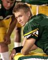
The cheerleader
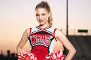
The queen bee
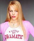
The geek/nerd
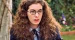
The rebel
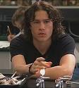
The New girl/boy

The cheerleader
The queen bee
The geek/nerd
The rebel
The New girl/boy
Research on Cliques
Cliques
Cliques are very important to any stereotypical teen angst film. A example that clearly identify cliques is 'Mean Girls'. Cliques shows the segregation in schools/between teenagers.
Types of Cliques;
Cliques are very important to any stereotypical teen angst film. A example that clearly identify cliques is 'Mean Girls'. Cliques shows the segregation in schools/between teenagers.
Types of Cliques;
- Jock and Cheerleaders.
- Populars.
- Geeks/Nerds.
- Emos.
- Loners.
- Stoners.
- Artsy People.
- People that don't belong to a clique (usually the protagonist in the film).
Tuesday, 15 November 2016
Analysing Film Companies Logo's
DreamWorks

The word 'dream' in DreamWorks suggests that the films provoke dreams.
The purple connotes sophisticated and luxurious, additionally, purple reflects night, henceforth emphasising the work 'dream' in DreamWorks.
The setting also emphasises the work 'dream', as the moon also symbolises night.
The clouds connotes magical, as they are lit up by the moonlight.
There is also a young boy sitting on the moon. This connotes that this film company manly targets children/young people.
The boy sitting on the moon is seen to be fishing could represent the boy as fishing for dreams.
Warpfilms


This the word 'WB' are make up a shield that is gold.
The gold shield looks heroic and to be looked up to, this represents the film company's status in the industry.
'WB' are the initials of Warner Brothers', this is memorable.
The gold also suggests that the company provides best quality.
In the background is the sky suggesting that this film company is on top.
Film 4

The logo is very simplistic, this emphasises the simplicity of the company.
The red contrast with the white.
The word film is in between lines that make a '4'.
The word 'film' is emphasised in this logo, this shows the audience straight away that it is a film company.
The '4' shows that the films are shown on channel 4.
Universal

The logo is of the Earth and the universe.
This logo could represent the films as being loved worldwide.
The image of the world gives the audience a visual representation.
The stars stand out against the black background.
Additionally, the Earth stands out with the light around it.
The word Universal is in san serif, this is in front of the Earth.
The title stands out against the black background.
20th Century Fox

The big gold statue emphasises the grandness of it.
The purple and pink sunset on the background, looks like a sunset, this could symbolises the LA sunset as the HQ is west of Beverly Hills.
The statue stands tall, this could suggest where they believe they stand in the film industry.
Vertigo Films

Vertigo- a sensation that you or the environment around you is moving/spinning.
The colours of the red and black represent danger.
Additionally, the double forward slash at the end Is a modern twist, this could represent the film company and shows that the company is revolutionary.
The font is bold san serif, this makes it stand out.
Take Two Productions
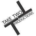
The logo includes film reel strip, this is to clearly show that it is a film company.
The diagonal angle, creates two T's this is the initial of the film company's name.
The only colours used are black and white this shows the simplicity of the company.
The words 'Take Two' suggests that errors are okay, that first time things may not go right, however they just try again.
Disney Productions

The castle the background suggests the grandness of the film company.
The font of the logo is a stylised version of the founders signature.
The title stands out in front of the castle.
The low-key lighting makes the castle and the title stand out.
The word 'dream' in DreamWorks suggests that the films provoke dreams.
The purple connotes sophisticated and luxurious, additionally, purple reflects night, henceforth emphasising the work 'dream' in DreamWorks.
The setting also emphasises the work 'dream', as the moon also symbolises night.
The clouds connotes magical, as they are lit up by the moonlight.
There is also a young boy sitting on the moon. This connotes that this film company manly targets children/young people.
The boy sitting on the moon is seen to be fishing could represent the boy as fishing for dreams.
Warpfilms
This logo is black and white and has bold shapes.
The globe in the background could represent that people can watch the film all around the world.
Additionally, the shape in which the title is in, looks like a lightening strike.
The bold shape also make the title stand out.
Warner Brothers
This the word 'WB' are make up a shield that is gold.
The gold shield looks heroic and to be looked up to, this represents the film company's status in the industry.
'WB' are the initials of Warner Brothers', this is memorable.
The gold also suggests that the company provides best quality.
In the background is the sky suggesting that this film company is on top.
Film 4
The logo is very simplistic, this emphasises the simplicity of the company.
The red contrast with the white.
The word film is in between lines that make a '4'.
The word 'film' is emphasised in this logo, this shows the audience straight away that it is a film company.
The '4' shows that the films are shown on channel 4.
Universal
The logo is of the Earth and the universe.
This logo could represent the films as being loved worldwide.
The image of the world gives the audience a visual representation.
The stars stand out against the black background.
Additionally, the Earth stands out with the light around it.
The word Universal is in san serif, this is in front of the Earth.
The title stands out against the black background.
20th Century Fox
The big gold statue emphasises the grandness of it.
The purple and pink sunset on the background, looks like a sunset, this could symbolises the LA sunset as the HQ is west of Beverly Hills.
The statue stands tall, this could suggest where they believe they stand in the film industry.
Vertigo Films
Vertigo- a sensation that you or the environment around you is moving/spinning.
The colours of the red and black represent danger.
Additionally, the double forward slash at the end Is a modern twist, this could represent the film company and shows that the company is revolutionary.
The font is bold san serif, this makes it stand out.
Take Two Productions
The logo includes film reel strip, this is to clearly show that it is a film company.
The diagonal angle, creates two T's this is the initial of the film company's name.
The only colours used are black and white this shows the simplicity of the company.
The words 'Take Two' suggests that errors are okay, that first time things may not go right, however they just try again.
Disney Productions
The castle the background suggests the grandness of the film company.
The font of the logo is a stylised version of the founders signature.
The title stands out in front of the castle.
The low-key lighting makes the castle and the title stand out.
Preliminary Task
During the process of creating this short film I filmed it and edited it. When filming I made sure that I used a lot of camera shots and angles.
I learnt about the 180 degree rule which is where the camera stays one side of an imaginary line. This keep the character on the right side when filming.
We also used a shot-reverse-shot, this helps continuity of the conversation between the characters.
Match on action is used in the short sequence when, the door handle is pulled down, this then cuts to the girl entering the room.
Subscribe to:
Posts (Atom)